Last week, in 5 More Tips for Incorporating Color Into Your Whiteboard Video we talked a little bit about the work we did to create the title sequence for the eight season of Weeds. Reviewing that opener was a good reminder about how much title sequences and explainer videos share in common. Although their final objectives may different greatly (one ends with a call to action, the other with the beginning of a long-form narrative) they both must find a way to draw viewers in, set a tone and deliver information.
To celebrate that similarity and further explore the value that animation can bring to storytelling, today we’re going to look at the design behind five great animated title sequences. Three of which come from television shows, two of which come from movies.
Animated TV Show Title Sequences We Love
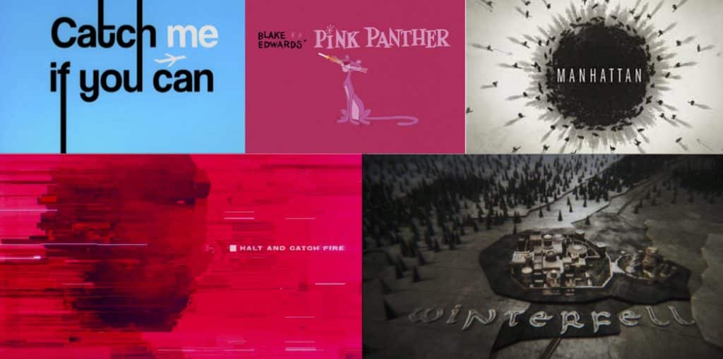
Halt And Catch Fire (TMC)
Halt and Catch Fire Main Titles from Patrick Clair on Vimeo.
The title credit for Halt and Catch Fire were directed by Patrick Clair (from Elastic) and designed by Raoul Marks. After a handful of meetings with the showrunners, the goal was to create something that captured the spirit of entrepreneurship (particularly during 80s, in which the show takes place) as well as touch on the primary themes of the show: ego, ambition and creativity. As the central motif to embody all of this, they decided upon a light bulb.
“With that in mind, we boarded out a sequence,” explained Marks in an interview with Art of the Title. “In essence these boards depicted the birth of a ‘signal’ and its journey to fire up a light. This was at the machine code level, an idea represented by simple graphic forms slowly evolving as it gathers pace.”
With inspiration from sources like David Lewandowski’s work on Tron: Legacy and the prologue sequence from X-Men: First Class, Elastic set out to weave those ideas together into something that stood out. One of the most notable things about this sequence is the glitchy-looking character portraits. To make this work, they took photos of the cast and then, as he describes, “manually ‘de-rezzed’ them…We experimented with many techniques to give it a feeling of constant flux and energy — textures, grain, undulating light flares to make the red/magenta feel electric and alive, never flat.”
Produced by: Elastic
Creative Direction by: Antibody
Executive Producer: Jennifer Sofio Hall
Director: Patrick Clair
Art Direction: Eddy Herringson
Animation and Design: Raoul Marks
Logo Design: Paul Sangwoo Kim
Production Manager: Bridget Walsh
Typography Consultant: Jennifer Walsh
Visual Researcher: Pat Da Cunha
Music: Trentemøller
Manhattan (WGN)
The opener for Manhattan was produced by Imaginary Forces, who had the difficult task of trying to create a sequence that juggled secrecy and scientific breakthrough. To that end, one of the most interesting things about the design of the opening credits is that the showrunners–looking for fresh eyes and open minds–intentionally did not provide Imaginary Forces with too much information.
Without seeing the pilot, Imaginary Forces focused on the human element. With hundreds of the brightest minds all living together in Los Alamos to try and create the bomb, they ran with the idea of juxtaposing home life and scientific work. To fit with the theme and come up with the aesthetic, the team did a lot of research into the time and place (with a particularly affinity for the since-declassified documents about the US nuclear program from the late ’40s and early ’50s). And interestingly enough, the concept was primarily designed by an employee named Griffin Frazen…who was just an intern there at the time.
Designed & Produced by: Imaginary Forces
Creative Director: Dan Gregoras
Art Director: Jeremy Cox
Executive Producer: Gabriel Marquez
Producer: Jon Hassell
Designer: Griffin Frazen
Animator: Sekani Solomon
Cel Animator: Peter Ahern
Editor: Karl Amdal
Additional Design: Audrey Davis, Tim Haldee
Music by: Jónsi & Alex
Game Of Thrones (HBO)
The Game of Throne‘s title sequence was directed by Angus Wall (also of Elastic) and it might surprise fans of the show to learn that the map motif wasn’t the original idea.
“In the original pilot script,” Wall described during an interview with Art of the Title, “Dan Weiss and Dave Benioff [the showrunners] had written a title sequence in which a raven flies from King’s Landing to Winterfell. We did some concept sketches around that idea but when the pilot was shot, they called us in and said: People are confused about where they are. Can you guys create little map pieces? Not a title sequence per se, but something that shows us exactly where we are when we go from place to place.”
From there, they created five pre-visualization map shots that were used each time the show transported to a different surrounding. This was a great way to help viewers gather their bearings, but unfortunately it seemed to interrupt the narrative flow of the story. As a result, the map idea was pushed (fortuitously!) into the open. Not only has it became one of the most iconic animated title sequences on television today, but it helps add a sense of realism and authenticity to the fantasy world in which the show takes place.
Production Studio: Elastic
Director: Angus Wall
POST PRODUCTION
Design Studio: Elastic
Art Director: Rob Feng
Lead Designer: Chris Sanchez
Designers: Henry De Leon, Leanne Dare
Concept Artists: George Fuentes, Rustam Hasanov
Storyboard & Concept Artist: Lance Leblanc
Production Artist: Patrick Raines
Producer: Hameed Shaukat
Executive Producer: Jennifer Sofio Hall
VFX Studio: a52
CG Supervisor: Kirk Shintani
Lead Surfacing & Lighting: Ian Ruhfass
CG Artists: Paulo de Almada, John Tumlin, Christian Sanchez, Erin Clark, Tom Nemeth, Joe Paniagua, Dan Gutierrez
2D Animation Artists: Tony Kandalaft, Brock Boyts
Compositers: Sarah Blank, Eric Demeusy
Smoke & Colorist: Paul Yacono
Editorial Company: Rock Paper Scissors
Editor: Angus Wall
Assistant Editor: Anton Capaldo-Smith, Austyn Daines
Executive Producer: Carol Lynn Weaver, Linda Carlson
Composer: Ramin Djawadi
Sound Design: Andy Kennedy
Animated Movie Title Sequences We Love
Catch Me If You Can (2002)
The title sequence for Catch Me If You Can was designed by a pair of French illustrator by the names of Florence Deygas and Olivier Kuntzel. With some inspiration by the great Saul Bass, Deygas and Kuntzel set out to create an opener that leveraged the interaction between music and animation.
“In order to capture the spirit of Leonardo DiCaprio’s character,” said Deyas in an interview with Art of the Title, “we chose to employ a creative process that did not resort to the use of high technology. We used the same techniques as the film’s protagonist, by imagining the characters in stamp form, made from the same cutters as those used in the film by Frank Abagnale Jr. We wanted to preserve that crudeness.”

“The original stamps, that we created in a few hours, are those that exist in the final product. The magic of the first try was not altered. The force of the sketch remained. That seemed to cohere with the Spielberg spirit.”
Armed with this style and spirit, Deygas and Kuntzel sought to bring their own graphic vocabulary to the typical handmade aspect associated with the title sequences of the ’60s.
“Embedding such lovely handmade animations,” Deygas further explained, “into a precise, down-to-the-millimetre décor on a computer served as a bridge between the past and the present. The audience was able to taste a remnant of that past through the visual comfort of which they are used to today.”
Production Company: Nexus Productions
Creative Directors: Kuntzel + Deygas
Produced by: Chris O’Reilly and Charlotte Bavasso
2D Animation: Agnes Fauve
Layout & Typography: Olivier Marquézy
Editing: Florent Porte
3D Supervision: Robin Kobrynski
Visual Effects Supervision: Patrice Mugnier
3D & Composition: Péregrine McCafferty and Pierre Savel
2D Composition: Pierre Yves Joseph
Compositing Assistance: Alexandre Scalvino
General Assistance: Ghislaine Marchand
Production Co-Ordinator: Julia Parfitt
Production Assistants: Juliette Stern and Lucy Glyn
Production Accountant: Ian Mansel-Thomas
The Pink Panther (1963)
The animated title sequence for The Pink Panther–which perhaps stands as the most iconic animated title sequence of all–was designed by Friz Freleng who, by this point in his career, had already achieved legendary status for his work at MGM and Warner Bros (where he directed hundreds of Looney Tunes cartoons). Not long after leaving Warner Bros., he and his production partner David DePatie were commissioned to create the opening titles for Blake Edwards’ The Pink Panther.
The resulting sequence, which starred a cool, charismatic cartoon cat, became so popular that United Artists (who had distributed The Pink Panther) had Freleng produce a short cartoon with this cartoon star entitled The Pink Phink. Not only was The Pink Phink immediately beloved by fans, but it won the 1965 Academy Award for Best Short. Following this success, DePatie-Freleng Enterprises produced a full series of Pink Panther cartoons.
Main Title by: DePatie-Freleng Enterprises
Animation Producers: David H. DePatie, Friz Freleng
Lead Graphic Designer: Corny Cole
Background Artists: George DeLado, Tom O’Loughlin
Layout Artist: Dick Ung
Animation Sequence Director: Hawley Pratt
Animators: Warren Batchelder, Dale Case, Manny Gould, George Grandpré, Laverne Harding, Ken Harris, Bob Matz, Norm McCabe, Manuel Perez, Don Williams
Production Coordinator: Harry Love
Music: Henry Mancini