Question: if someone is reading your blog, how many facts and figures can you throw at them before their eyes start to glaze over?
Answer: Probably not very many.
Lists, charts, and graphs are easy for readers to skip. Infographics are a little better, but wouldn’t it be nice if you could make them even more eye-catching? What if you could guide the reader from point to point effortlessly? Gifographics can do both of these things. We’ll look at how you can use them on your website and social media, but first…
What are Gifographics?
You might be scratching your head wondering: what are gifographics anyway? Gifographics are animated infographics formatted as GIFs. That means they take the motion of an animated GIF and the layout of an infographic to create an eye-catching and memorable visual. The resulting animation is packaged in a smallish file that you can embed into websites, emails, blogs, and other online content.
Gifographics = The Best Of Both Worlds
By taking the strongest elements of two already strong graphic ingredients, your visuals can accomplish a lot more. Gifographics effectively combine the instructional and highly linkable format of an infographic with the animation of a GIF to build a visual that is the best of both worlds.
Someone might not be ready to press play on your video, but they almost have no choice but to watch your gifographic. They don’t challenge attention spans with large amounts of plain text. Plus the short, looping format is difficult to ignore.
Gifographics can keep people engaged in what they’re reading and hold their attention longer. Take this example from AJ+. It explains the results of a Stanford University study performed in San Francisco High Schools.

This graphic presents one piece of information at a time, pairing it with an image to help you remember what you’ve read. The animation helps direct your attention to the piece of information you should be looking at next.
Imagine the difference if you presented this information as a simple list. Readers could skim over it without really absorbing the details. Presenting it as a gifographic invites viewers to slow down and engage with the content.
Ultimately, the whole point of a gifographic is to convey information that you find to be valuable to the reader in the most effective way possible. Here are a few ways you can use gifographics.
1. To describe a process
Sometimes animation is the best way to illustrate a process, but you still need a textual explanation to go along with it. The below example is a perfect illustration of just that. It shows you how to learn one of the most famous dance moves of all time: the moonwalk.
This gifographic uses a black-and-white color scheme to help the viewer identify which foot is which. This simplifies an otherwise complicated process. It also uses animation to illustrate each step of the dance move.
The graphics simply don’t work without being able to see the process in motion. You might be able to learn how to moonwalk seeing a sequence of images side-by-side, but it would be a lot harder. Learning to do it with only text to help you would be almost impossible.
Besides, animation is a lot more fun.
2. To show change over time
Gifographics are also perfect for condensing information that would otherwise require multiple images or charts. They can show change over time, compare multiple data points at once, or provide essential context. Consider the following example:
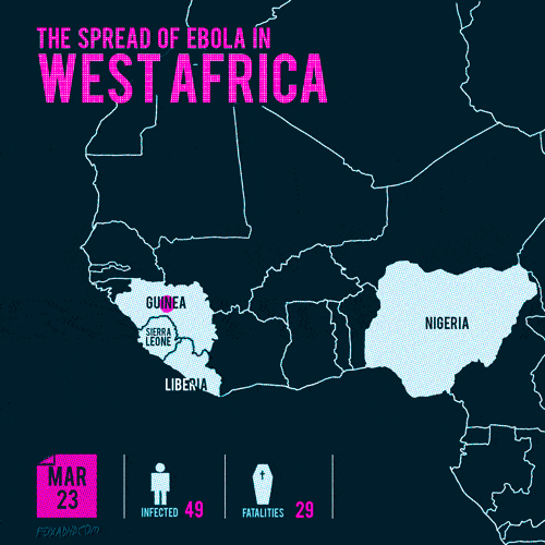
The gifographic above uses growing dots and changing calendar dates to show the spread of Ebola in three countries. By using a gifographic, the designer can fit information about four countries in a single image. Watching the spread happen makes it feel more urgent than simply reading numbers on the screen. It allows you to show multiple data points and reduces the need for multiple images or dry tables of data.
3. To simplify complex information
Like any animation, gifographics can be as simple or as complex as you need to get your point across. So far, most of our examples have relied on basic movement–a growing dot or a shifting foot. The example below gets a little more complicated, combining the animation of an engine with a numbered list and a color-coding system to walk you through How a Car Engine Works. There’s a ton of information here, and it’s a lot easier to follow thanks to the visual cues.
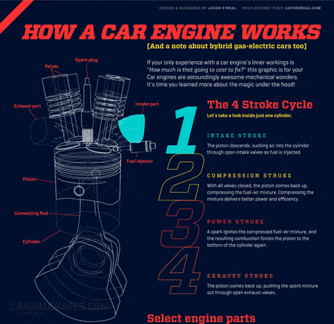
Well-designed gifographics can make complex information easier to grasp. That means people are more likely to stick with you and retain the information. While producing a gifographic tends to be a little more expensive than an infographic, the impact may be worth the investment.
Where to use gifographics
You can use gifographics almost anywhere on the web. If you’re presenting the results of a survey, illustrating change over time, or explaining a process, consider how a gifographic might help. An animator can help you make a gifographic that achieves any or all of these goals. Then all you have to do is share them. Embed one on your website, post it on social media, or link it in an email.
For help designing a gifographic for your audience, reach out to the animation experts at IdeaRocket